 Patrick Jackson, author of the popular Potato Pals series, Shine On! and Everybody Up!, explores the importance of design and ‘eye candy’ in materials for young learners.
In the natural world, colour and pattern are keys to reproduction and survival. The attention of bees is guided by precisely marked, competing flowers. Camouflaged moths hug tree trunks, invisible to their predators. Birds and animals show off their plumage and markings to attract a partner. Phosphorescent creatures in the warmer oceans mirror the night sky, filled with the stars that guide our journeys across its expanses.
The same is true with the learning journey we embark on with pre-elementary and elementary students. The learning materials we use must guide, motivate and excite, firstly and above all through the eyes of our young students. The characteristics and effectiveness of materials are largely determined by the visual impression they make and the deeper design decisions that undergird their development. As teachers and publishers we rightly should embrace the extent to which design decisions influence the whole learning process.
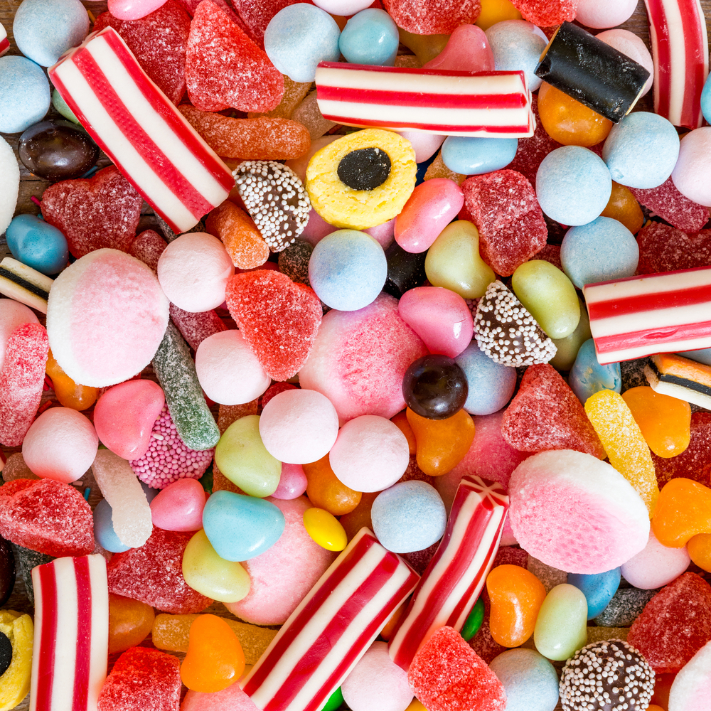
An Oxford University Press designer once said, “I like to make books look like candy.” Children, more than any other age group, are visual learners. The younger the learners, the more important the visuals are. That is not to say that they are not important with older age groups, but in the absence of a lot of printed text, children depend on what they can see on the pages (or increasingly, the screens) in front of them. The classroom can be very cut off from the outside world and exciting images from beyond the classroom bring the experience of learning a new language alive.
Young learners benefit deeply from interacting with different illustration styles and different media. These inspire creativity as well as maintain students’ attention. Good illustrations convey emotion and that in turn motivates young learners. The aesthetic experience should be pleasurable and the content memorable. No doubt we all remember our favourite illustrations from the books of our childhood. Furthermore, language itself is not linear and the visual presentation of language in context is a powerful tool that mimics the state of language in the real world. It has been proven that language is more memorable when presented with images, particularly images that children can identify emotionally with. Again, this replicates their experience of learning their first language.
The layout of activities on the page gives a book its feel and determines how we will respond. The lesson should flow smoothly from well signposted activity to the next. Icons and titles are part of this rhythm. The font and size of rubrics are also very important, as is the amount of blank space on the page. This informs how we perceive the level of difficulty of the material. The feel and finish of a course book are also vital to our experience of a book. Who hasn’t stroked the cover of a book or run their hands down its spine? Who hasn’t been frustrated as a child by trying to write or colour on the wrong quality of paper? All of these decisions, taken by the editorial and design teams, contribute to the soul of the materials and the ‘user experience’.
We call something superficially attractive but lacking deep meaning ‘eye candy’. They also say that ‘you can’t judge a book by its cover’. On the contrary, we can and do tell a great deal about course books by looking at their covers, and a bit of eye candy on their pages for young learners is just what they like and need. Their first impression of the path ahead is partly determined by the design of their very first English book.
So let’s not underestimate the work of the design department as we choose the materials we use. Let’s celebrate those beautiful illustrations and gorgeous double spreads. Let’s obsess about clear, well-set rubrics. Let’s appreciate delicious paper quality. Let’s delight at a bit of bling on a cover. As a great scholar may or may not have once said, “Per pulchra ad astra.” Through beauty to the stars!
I agree with every single word in the article, but I think nothing can have value without a good teacher.
I agree with every single word of your comment, Saud! Thank you.
[…] via Making books look like candy — Oxford University Press […]
Reblogged this on ELT by M Amin Gental.
Thanks.
Reblogged this on hungarywolf.
Thank you!
I believe children also have the ability to project their own feelings into the illustrations they encounter…Like when kids use toys. The doll doesn’t change but the emotions that reflect how the child believes the doll feels can. So I am curious… Do children always need to have super detailed illustrations when they are are manipulating the illustrations like they would a toy. Great article.
Thanks for your comment Rhett and good to see you on Twitter. You raise a very interesting point which makes me reevaluate the whole premise of my article. Check out this very cheesy but rather good ad for Ireland’s Ancient East. https://www.youtube.com/watch?v=-2gWiRU2vxk
I really need to find out more but in the meantime I am pleased with our pretty, delicious looking books!
I think that Ss under 5 years old are very sensitive with the colour. They might be more suitable for these kinds of books.
Also very interesting how colour affects mood. A colleague painted our classroom the most amazing turquoise colour because it would stimulate communication. The painters kept asking “Are you sure about this?”!